 Off The Grid Play
Designed for Delight: What Casumo's Playful Brand Identity Teaches Us About Building Joyful Products
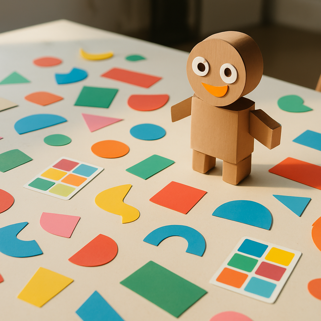
Most companies talk about being "fun." Very few commit to it at the level of their visual DNA, their language, and their product architecture. When a small team founded Casumo in Malta in 2012, they entered the online casino industry — a space then dominated by dark interfaces, flashing gold text, and interchangeable branding — and made a genuinely strange decision: to look and feel like a playful storybook instead. More than a decade later, that decision reads less like a quirk and more like a masterclass in brand-led design, one with lessons for anyone building products in any industry.
A Character Instead of a Logo
The most recognizable element of the brand is not a wordmark but a creature: a soft, rounded, one-eyed mascot that has anchored Casumo's identity from the beginning. This matters more than it might seem. Logos are symbols; characters are relationships. A mascot can be curious, sleepy, celebratory, or encouraging — it gives the brand a repertoire of emotions to deploy across every touchpoint, from loading screens to emails.
This is a page from the playbooks of Nintendo and Pixar rather than the gambling industry, and that's exactly the point. The Scandinavian founders brought a distinctly Nordic design sensibility — generous white space, soft pastel palettes, gentle geometry, and an almost toy-like simplicity — into a category that had historically equated excitement with visual noise. The contrast made the brand instantly legible: in a row of screenshots, you could identify it with the logo removed. Ask how many products in any category pass that test.
The Gamified Journey as Brand Expression
Plenty has been written about gamification as a retention mechanic, but the more interesting angle is gamification as brand coherence. Casumo built its user experience around an adventure metaphor — progression, levels, valuables to collect, a sense of a journey unfolding — and the crucial detail is that this structure matched the visual identity perfectly. A whimsical character world paired with a quest-like experience creates a single, unified statement: this is a place of play.
Compare that with companies that bolt points and badges onto an otherwise sterile product. The mechanics may be identical, but the effect is entirely different, because gamification without a matching identity feels like a tactic, while gamification inside a coherent playful world feels like a personality. The lesson generalizes well beyond gaming: delight is not a feature you add; it's a worldview you either commit to everywhere or shouldn't attempt at all.
Tone of Voice as a Design Material
The playfulness extends into language. Where the industry default was urgent capital letters and exclamation marks, Casumo's copy has tended toward warmth, lightness, and a conversational wink — the tone of a friendly companion rather than a barker outside a shop. Naming conventions, interface labels, and campaign copy all pull from the same register.
Writers and designers often treat tone as decoration, but this case shows it functioning as architecture. Consistent voice is what makes hundreds of small touchpoints — buttons, notifications, support replies — feel like a single character speaking. It's also a trust device: a brand that sounds calm and human implicitly signals that it isn't trying to overwhelm your judgment. In an industry where regulators and players alike scrutinize how companies communicate, a measured, friendly voice is both an aesthetic and an ethical position.
Playfulness and Responsibility Can Coexist
A fair question about any real-money gaming brand is whether charm papers over risk. What makes this case study credible rather than merely cute is that the playful surface has coexisted with the industry's regulatory framework — licensing, responsible gambling tools, deposit limits, self-exclusion options — and with design choices that keep information legible rather than hypnotic. Cheerful design and clear-eyed safeguards aren't opposites; arguably, a calm and readable interface serves responsible play better than the sensory assault of traditional casino aesthetics ever did.
That's a nuance worth sitting with. Critics sometimes assume that making an experience delightful is inherently manipulative. But visual noise, urgency, and confusion are far more manipulative tools than softness and clarity. A brand like Casumo demonstrates that you can compete on charm and coherence instead of aggression — and that players notice the difference.
What Builders Can Borrow
Distilled, the case offers a short checklist for any product team, in any category:
- Pick an emotional position competitors have abandoned. In a sea of sameness, a genuinely different feeling is the cheapest differentiation available.
- Give the brand a face with a range of expressions, not just a mark.
- Align mechanics with identity — the experience structure should tell the same story as the visuals.
- Treat copy as part of the design system, with the same consistency standards as color and type.
- Let playfulness carry responsibility, using clarity and calm as features rather than legal afterthoughts.
Founded on the bet that an industry known for noise was ready for whimsy, Casumo turned a design philosophy into a durable identity. The broader takeaway belongs to everyone who makes things: in almost any market, the most contrarian move available is simply to be delightful — completely, coherently, and on purpose.